Page Editor
Overview
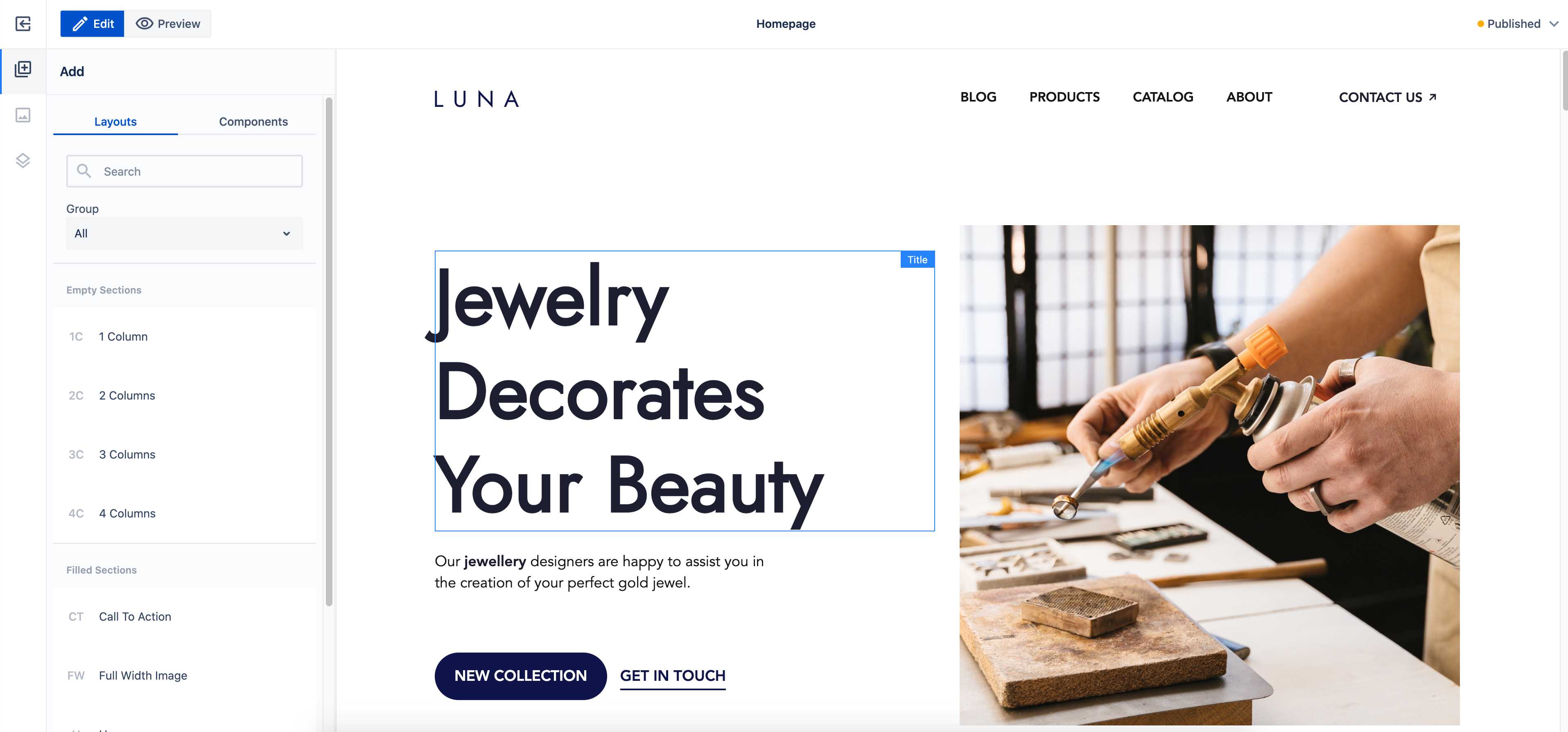
Page Editor, a core part of WebSight CMS, is an essential tool for content authors. It allows the content authors to build pages using components in a WYSIWYG way. They can work with components on a page using intuitive drag-and-drop functionality. They can also provide content and configuration to the components.
Component actions
When a component is selected the list of available actions becomes visible in the toolbar. Action name is the technical identifier used, such as the Edit configuration. List of actions available by default:
| Title | Name | Description |
|---|---|---|
| Edit | inline-edit |
Starts inline editing, see Inline editing |
| Properties | edit-properties |
Opens a dialog to edit component properties. |
| Copy | copy |
Copies the component. |
| Cut | cut |
Cuts the component. |
| Paste | paste |
Pastes the component after copy or cut. |
| Select parent | select-parent |
Changes active component to the parent component. |
| Delete | delete |
Deletes the component. |
Technical details
Edit Mode
Edit mode is used for editing page content.
Workspace content presentation
Edit mode displays the edited page inside an iframe. The iframe is stretched vertically to match the content height to provide a canvas-like experience to content authors. It is accomplished by reacting to content height changes and fixing issues that result from displaying an iframe in this way (like using vh unit).
As a result, the edited page itself is not scrollable, so the content author will not see any changes to the edited page that happen on scroll (for example, sticky positioning will not work).
Workspace Overlays
The edited page is (mostly) not altered; all UI is displayed in edit mode directly. All the UI elements of the mode are displayed outside the iframe to increase the separation of the two. We wanted to achieve the highest possible level of sandboxing for the edited page.
The especially important and technically complex parts of edit mode UI are overlays, including:
- Component selectors - "borders" marking the content of a given component instance.
- Selected component toolbar - toolbar with actions allowed for a selected component.
- Placeholders - placeholders generated for components without content.
All these items are displayed on top of the iframe containing the edited page. The content author interacts with overlays, not the elements of the edited page.
The iframe with overlays on top of it is called workspace.
Areas
Overlays locations are based on areas, the representation of size and position of the components in the edited page. The areas are calculated based on the edited page elements. Each component has a corresponding area, covering all its DOM elements.
To display overlays that are up to date with what is happening on the edited page, it is not enough to calculate areas once, on the iframe load. Nor is it enough to recalculate them on actions (like adding, deleting and editing a component). Thus, we observe all DOM elements inside the iframe to react to size and position changes of components and recalculate the areas every time. This ensures that the overlays display correctly in cases like:
- asynchronous loading of resources (like images and videos).
- dynamic changes using JavaScript scripts.
- dynamic changes using CSS animations.
Preview mode
Preview mode displays the edited page inside an iframe as well, but in this case the iframe’s height adjusts to fit the available space in the page editor. This way the iframe is displayed in a more "natural" way, similar to how the published page is displayed in a browser window. The iframe is scrollable, meaning it will react to scroll events (e.g., to support sticky elements). It also handles the vh unit properly.