Cards List & Card Item
The Cards List component can be used to arrange multiple card components on a page. If you have 20 cards, you may want to display them in a grid with 4 items or 5 items per row or as a slider with 4 or 5 cards per slide. A Cards List component makes it easy to quickly switch between different layouts.
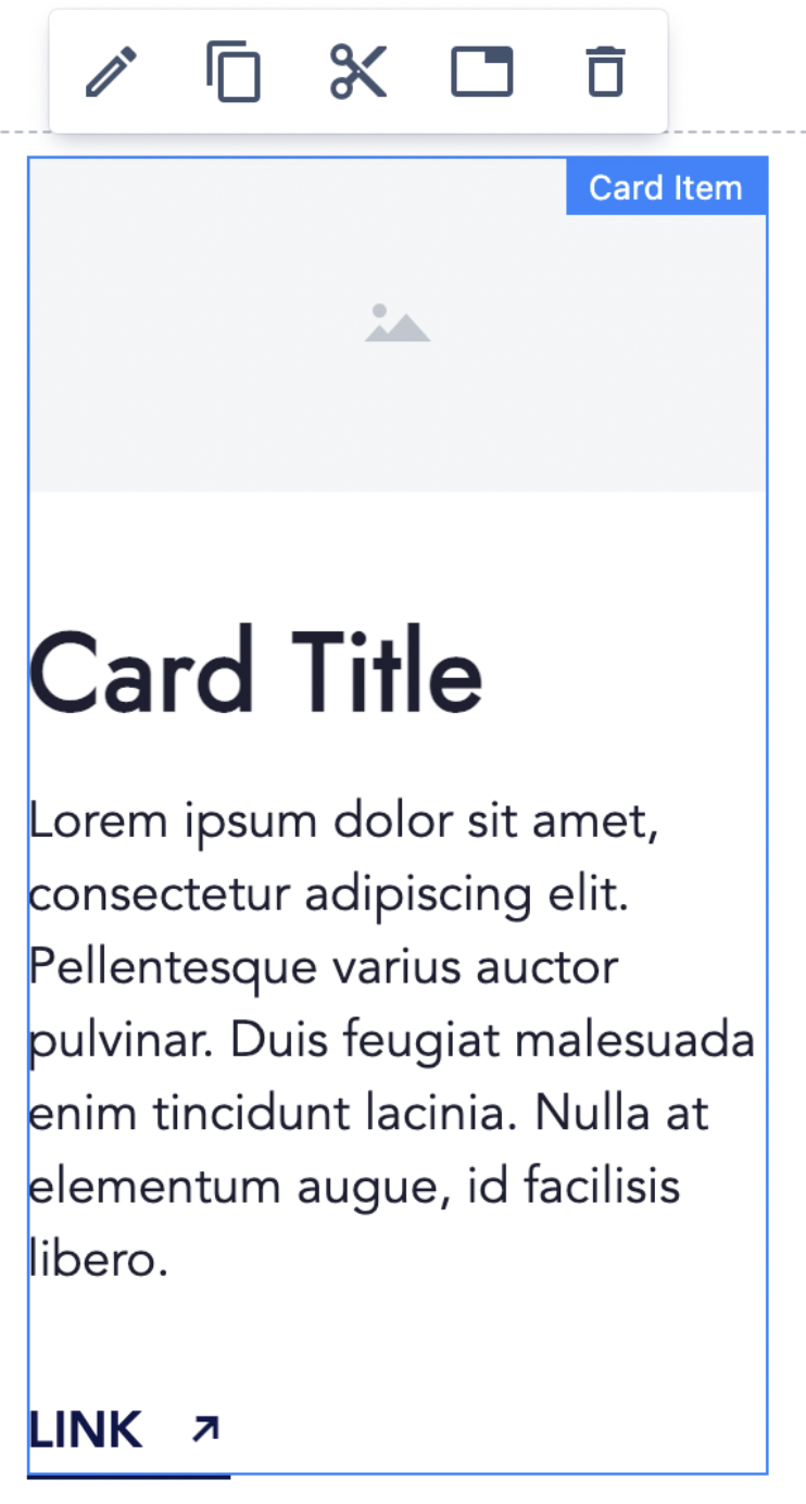
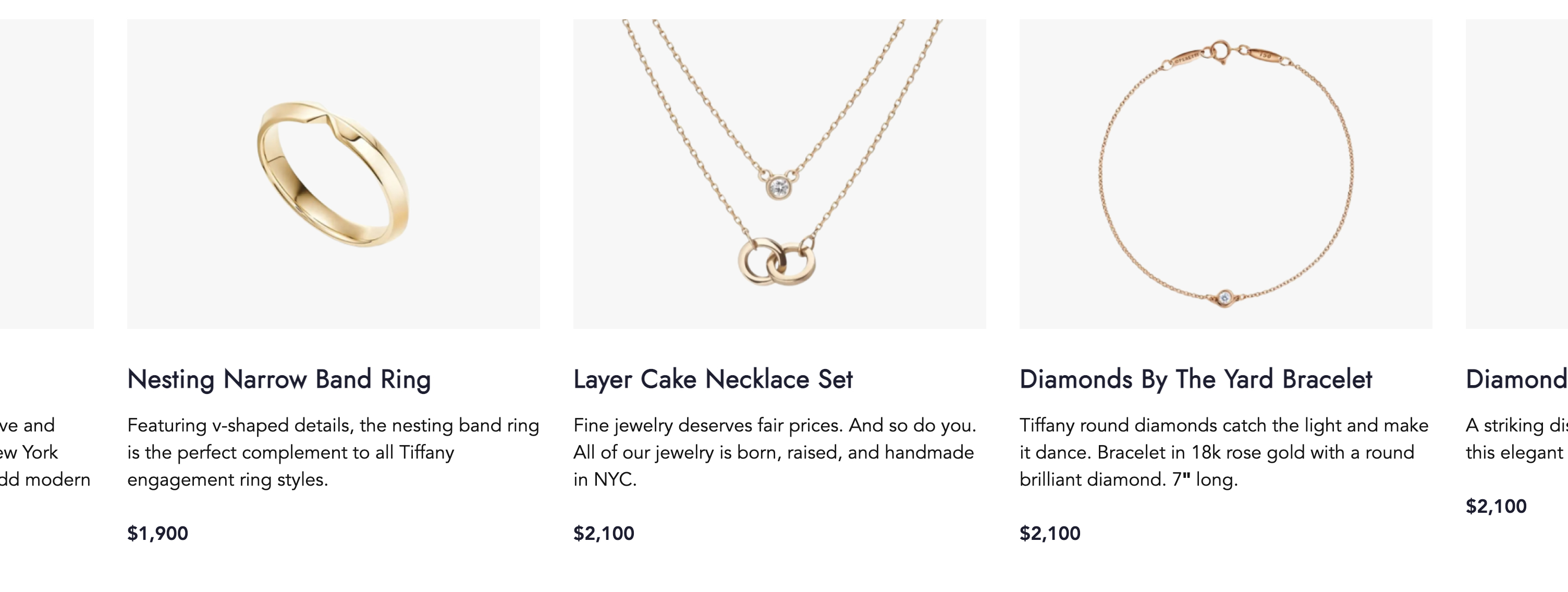
Cards may contain an image, text and a CTA.
Usage
Drag & drop the Card List component to a Page section. Cards List is prefilled with 3 initial Card Items.
You can drag & drop additional Card Item to the Card List component, or delete unneeded Card Items.
Authorable properties
Click  ("Edit" icon) to see all available Cards List properties:
- You can check an option Display as a slider to switch on the slider mode. The slider is fully responsive and supports touch and swipe navigation as well as mouse drag for the desktop.
- You can select the Heading level for the Cards headings. Choose the level that is most appropriate from SEO and accessibility perspective (options H1 - H6).
- You can select the Heading size to increase or decrease cards headings' font size.
- You can change Items per row for each breakpoint separately.
- if the slider option is selected, this number will control how many Cards are visible at once (on each slide).
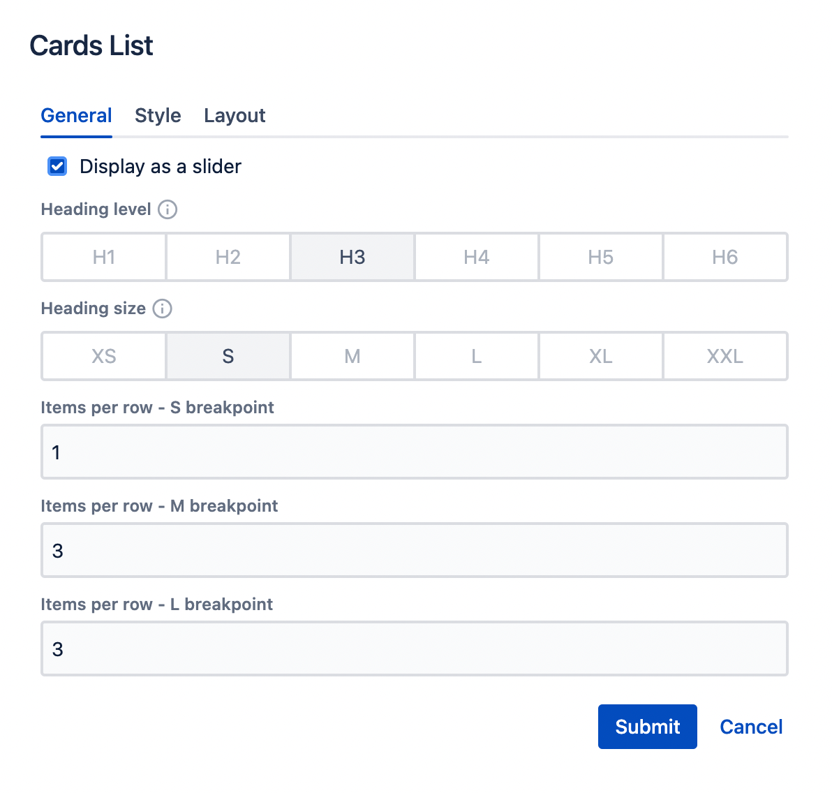
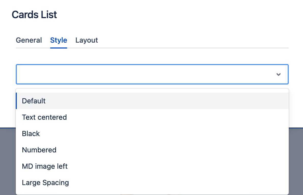
- You can set the Style for the Cards List using the Style tab.
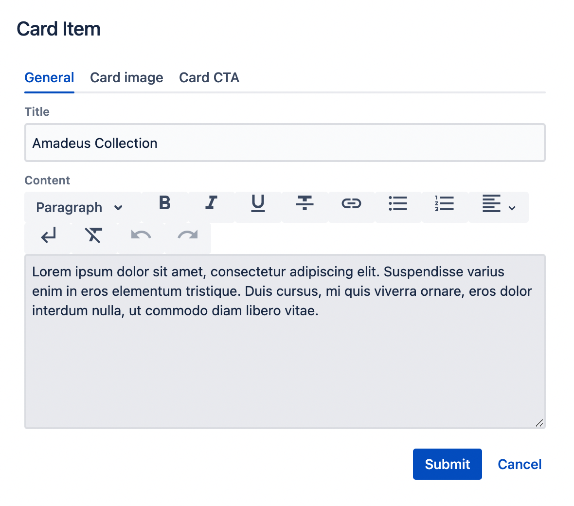
Click ("Edit" icon) on Card's Item to see its properties:
- On the General tab you can add:
- Title - the Card's Item heading.
- Content - the text to be displayed in the Card Item.
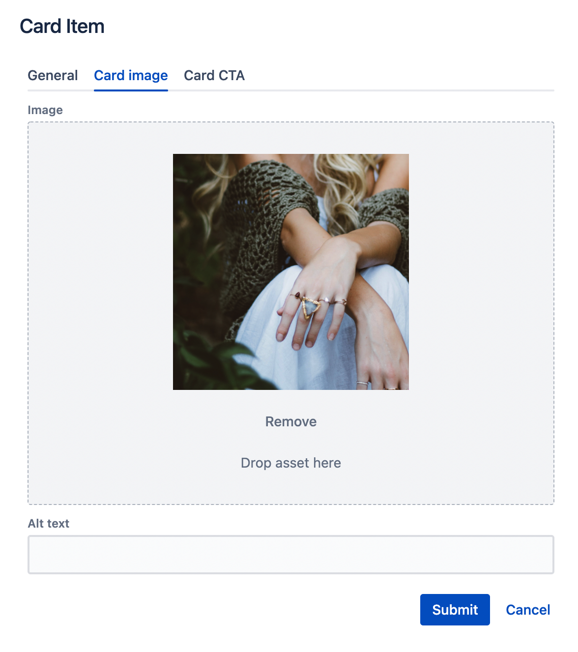
- On the Image tab you can add:
- an Image - you can open the left assets panel and drag&drop an image to the asset section;
- additionally, you can provide an alternative text (alt) to describe an image. Leave it blank only when the image is purely decorative.
- You can add CTA to the Card Item as any other CTA component using the Card CTA tab. (See CTA description for details.)
Rendered component
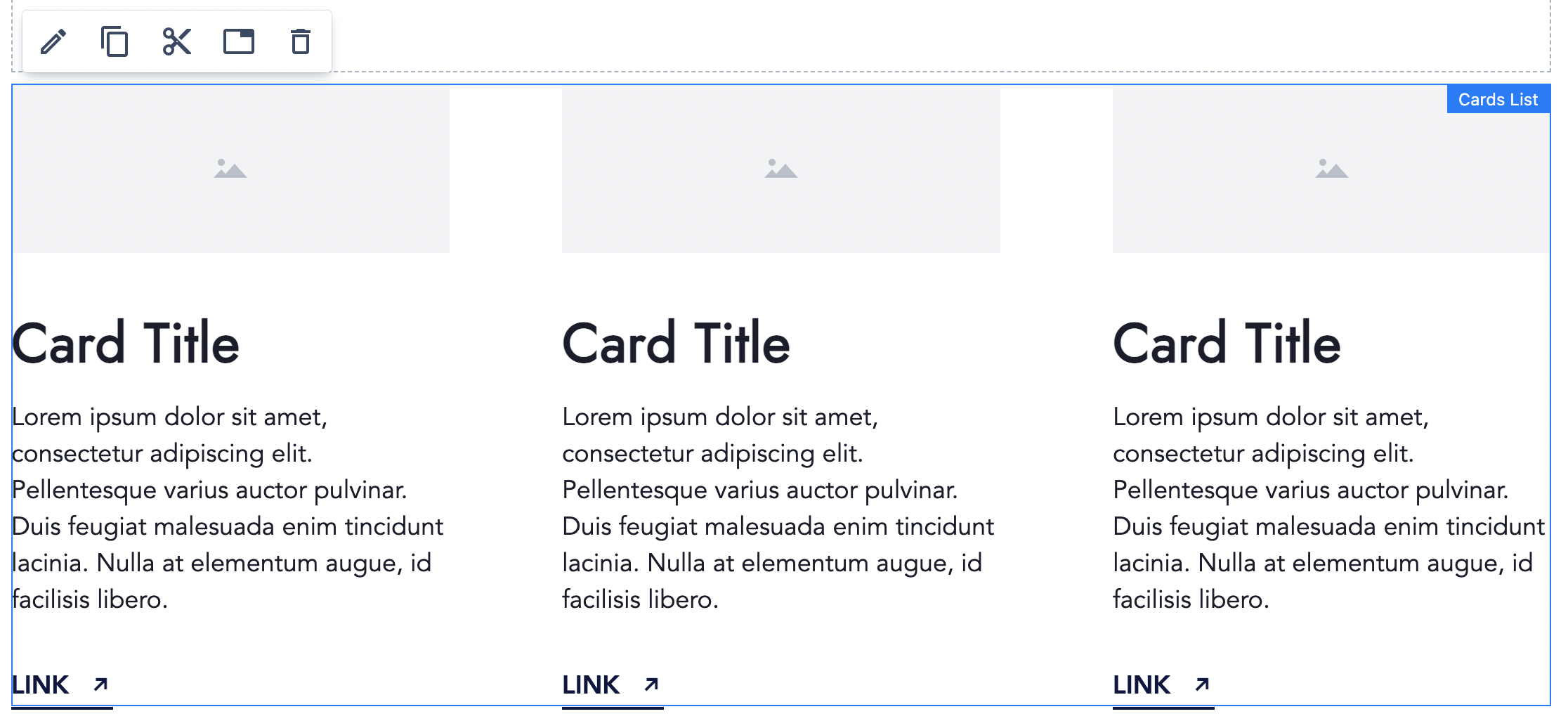
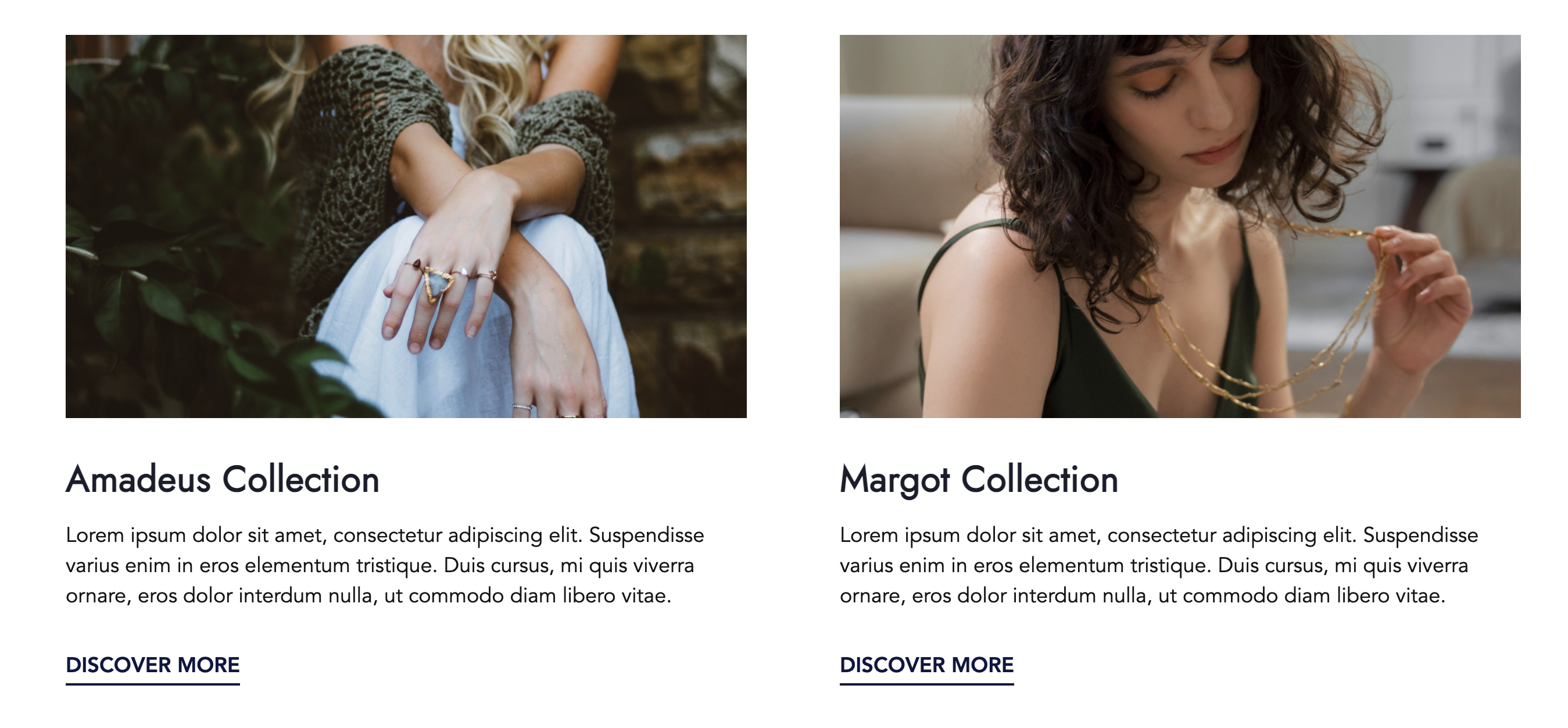
Here is an example of a Cards List component with 2 Card Items inside. 2 items per row are set. Each Card consists of an image, text and a text link:
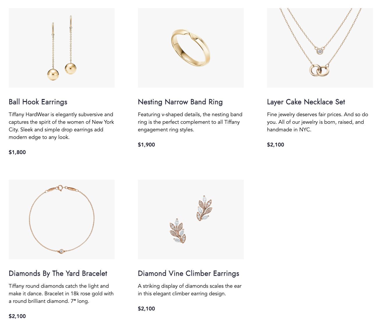
A Cards List with 5 Card Items and 3 items per row set:
A Cards List with 5 Card Items, 3 items per row set and selected slider mode (user can drag cards left/right to see previous or next items):
Cards List with three Items with "Text Centered" Style variant selected (On Cards List level):