Button Dropdown
wcm/dialogs/components/richtext/ui/buttondropdown
Description:
Component allows to add buttons group to menu bar. Buttons should be added as a children.
Configuration
-
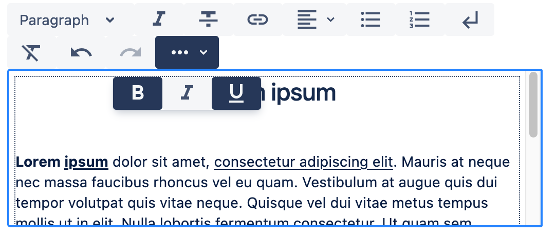
title -
string(required)
Group title. It’s displayed as a tooltip. -
icon -
string
Icon name from Material Icons. If pesent than dropdown will be presented under button with given icon. Otherwise dropdown will be presented under button looks like button with first active action or like first available button - if none action is active. -
activable -
boolean
If true means that button will be presented as active if any action under it is active.
Children
- Button - Nodes defining available actions.
Example
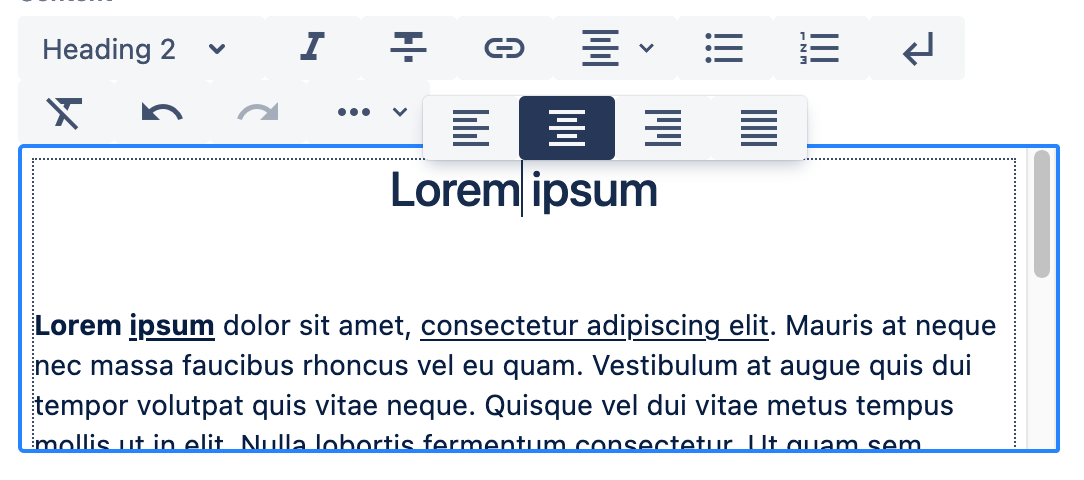
"textalign": {
  "sling:resourceType": "wcm/dialogs/components/richtext/ui/buttondropdown",
  "title": "Text Alignment",
  "left": {
    "sling:resourceType": "wcm/dialogs/components/richtext/ui/button",
    "title": "Left Align",
    "icon": "format_align_left",
    "plugin": {
      "sling:resourceType": "wcm/dialogs/components/richtext/plugin/textalign",
      "alignment": "left"
    }
  },
  "center": {
    "sling:resourceType": "wcm/dialogs/components/richtext/ui/button",
    "title": "Center Align",
    "icon": "format_align_center",
    "plugin": {
      "sling:resourceType": "wcm/dialogs/components/richtext/plugin/textalign",
      "alignment": "center"
    }
  },
  "right": {
    "sling:resourceType": "wcm/dialogs/components/richtext/ui/button",
    "title": "Right Align",
    "icon": "format_align_right",
    "plugin": {
        "sling:resourceType": "wcm/dialogs/components/richtext/plugin/textalign",
        "alignment": "right"
    }
  },
  "justify": {
    "sling:resourceType": "wcm/dialogs/components/richtext/ui/button",
    "title": "Justify Align",
    "icon": "format_align_justify",
    "plugin": {
      "sling:resourceType": "wcm/dialogs/components/richtext/plugin/textalign",
      "alignment": "justify"
    }
  }
}