Rich Text Editor Configuration
Configuration defines RTE toolbar and functionalities
Using configuration
RTE provides configurations which can be used and customized:
/libs/wcm/dialogs/components/richtext/configurations/default- default configuration; dedicated for views with big width, like modals/libs/wcm/dialogs/components/richtext/configurations/compact- configuration with reduced toolbar - might be used in narrow views, like Side Panel
Configuration can be referenced by path or defined inline. If inline configuration is defined then referenced configuration is ignored.
Example using default configuration defined by RTE:
"content": {
  "sling:resourceType": "wcm/dialogs/components/richtext",
  "name": "content",
  "label": "Content"
}
Referencing configuration
RTE component allows to define configuration string propery. Value is a absolute path to configuration node.
Referencing configuration by path:
"content": {
  "sling:resourceType": "wcm/dialogs/components/richtext",
  "name": "content",
  "label": "Content",
  "configuration": "/apps/myapp/components/common/rte/myconfiguration"
}
Inline configuration
Inline configuration can be definde in dialog under RTE filed in node named configuration.
Inline configuration defined by RTE:
"content": {
  "sling:resourceType": "wcm/dialogs/components/richtext",
  "name": "content",
  "label": "Content",
  "configuration": {
    "bold": {
      "sling:resourceType": "wcm/dialogs/components/richtext/ui/button",
      "title": "Bold",
      "icon": "format_bold",
      "plugin": {"sling:resourceType": "wcm/dialogs/components/richtext/plugin/bold"}
    }
  }
}
Extending and overriding configuration
Configuration (referenced or inline) can extend other configuration by using sling:resourceSuperType, see Sling Resource Merger (/mnt/override) and customize it with options comming from Resource Merger, like sling:hideChildren.
"configuration": {
  "sling:resourceSuperType": "wcm/dialogs/components/richtext/configurations/default",
  "sling:hideChildren": "[italic]",
  "bold": {
    "sling:resourceType": "wcm/dialogs/components/richtext/ui/button",
    "title": "Bold",
    "icon": "format_bold",
    "plugin": {"sling:resourceType": "wcm/dialogs/components/richtext/plugin/bold"}
  }
}
Building configuration
Configuration is prepared by two kinds of components:
-
UI - components define UI element added to menu bar.
-
plugin - components provide functionality
Separation UI and plugin components allows to define toolbar in many variants depending of authors needs. E.g. bold action can be added as a separated button or one of buttons grouped in the dropdown, different headings can be added in a dropdown list or as a separated buttons.
There is also possibility to create dedicated UI components and build whole toolbar using just them, or create new plugin and add it to toolbar using existing UI component.
Configuration examples:
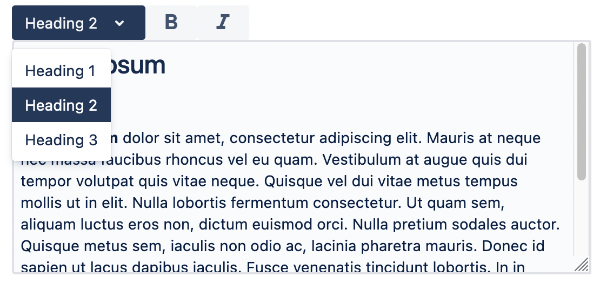
"textstyle": {
  "sling:resourceType": "wcm/dialogs/components/richtext/ui/dropdown",
  "title": "Text Style",
  "h1": {
    "sling:resourceType": "wcm/dialogs/components/richtext/ui/dropdown/dropdownitem",
    "title": "Heading 1",
    "plugin": {
      "sling:resourceType": "wcm/dialogs/components/richtext/plugin/heading",
      "level": 1
    }
  },
  "h2": {
    "sling:resourceType": "wcm/dialogs/components/richtext/ui/dropdown/dropdownitem",
    "title": "Heading 2",
    "plugin": {
      "sling:resourceType": "wcm/dialogs/components/richtext/plugin/heading",
      "level": 2
    }
  },
  "h3": {
    "sling:resourceType": "wcm/dialogs/components/richtext/ui/dropdown/dropdownitem",
    "title": "Heading 3",
    "plugin": {
      "sling:resourceType": "wcm/dialogs/components/richtext/plugin/heading",
      "level": 3
    }
  }
},
"bold": {
  "sling:resourceType": "wcm/dialogs/components/richtext/ui/button",
  "title": "Bold",
  "icon": "format_bold",
  "plugin": {
    "sling:resourceType": "wcm/dialogs/components/richtext/plugin/bold"
  }
},
"italic": {
  "sling:resourceType": "wcm/dialogs/components/richtext/ui/button",
  "title": "Italic",
  "icon": "format_italic",
  "plugin": {
    "sling:resourceType": "wcm/dialogs/components/richtext/plugin/italic"
  }
}
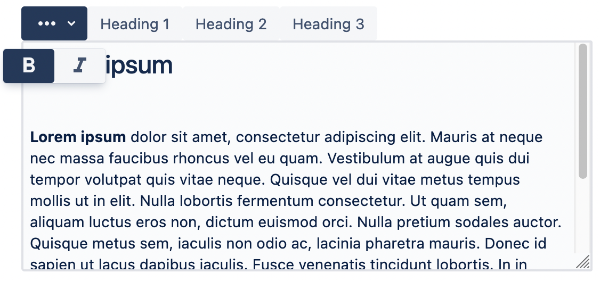
"textformat": {
  "sling:resourceType": "wcm/dialogs/components/richtext/ui/buttondropdown",
  "icon": "more_horiz",
  "activable": true,
  "title": "Text Format",
  "bold": {
    "sling:resourceType": "wcm/dialogs/components/richtext/ui/button",
    "title": "Bold",
    "icon": "format_bold",
    "plugin": {
      "sling:resourceType": "wcm/dialogs/components/richtext/plugin/bold"
    }
  },
  "italic": {
    "sling:resourceType": "wcm/dialogs/components/richtext/ui/button",
    "title": "Italic",
    "icon": "format_italic",
    "plugin": {
      "sling:resourceType": "wcm/dialogs/components/richtext/plugin/italic"
    }
  }
},
"h1": {
  "sling:resourceType": "wcm/dialogs/components/richtext/ui/button",
  "title": "Heading 1",
  "plugin": {
    "sling:resourceType": "wcm/dialogs/components/richtext/plugin/heading",
    "level": 1
  }
},
"h2": {
  "sling:resourceType": "wcm/dialogs/components/richtext/ui/button",
  "title": "Heading 2",
  "plugin": {
    "sling:resourceType": "wcm/dialogs/components/richtext/plugin/heading",
    "level": 2
  }
},
"h3": {
  "sling:resourceType": "wcm/dialogs/components/richtext/ui/button",
  "title": "Heading 3",
  "plugin": {
    "sling:resourceType": "wcm/dialogs/components/richtext/plugin/heading",
    "level": 3
  }
}
Available Components
Available UI components:
Available plugin components are described here.
Custom Components
There is a possibility to prepare custom components. To do so there is a need to prepare files according to UI or plugin specification. In case of plugin component there is also need to provide TipTap extensions. They can be taken from existing extensions or written by a developer according to TipTap extension interface.