Button
wcm/dialogs/components/richtext/ui/button
Description
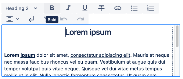
Component allows to add edit action as a button visible in menu bar. Button can be displayed with title or icon.
Configuration
-
title -
string(required)
Action title. It will be visible in a tooltip. It also will be shown on button in case of lack of icon property -
icon -
string
Icon name. If set then button will be visible with defined icon. Available icons can be found in Material Icons font.
State
-
isActive -
boolean
Defines if button should be checked as active. -
isDisabled -
boolean
Defines if button should be disabled.
Children
- plugin - node defines edit action caused by a button.