Page Section component
The Page Section component renders a section html tag with a top & bottom padding. It can only be added directly to the Main Content parsys.
Usage
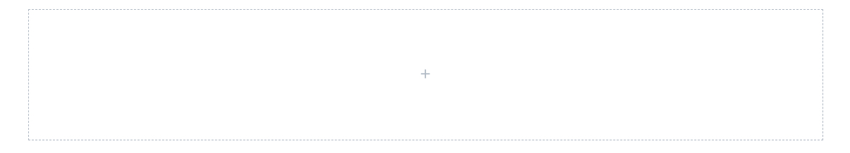
If you drag & drop a single Page Section to the page, you will see a default placeholder.
Page Section components in the Howlite project always have 12 columns. The components added inside can be resized to 1-12 columns.
If you need to resize or group content inside a page section use a Container component.
Authorable properties
Click  ("Edit" icon) to see all Page Section component's editable properties.
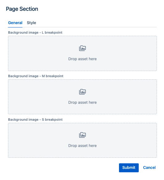
- you can drag & drop an image from the left assets panel, to add a background image (for each breakpoint separately).
- each breakpoint's asset will be rendered on this breakpoint only. For example, if you leave M breakpoint image blank, nothing will be rendered on tablet resolutions.
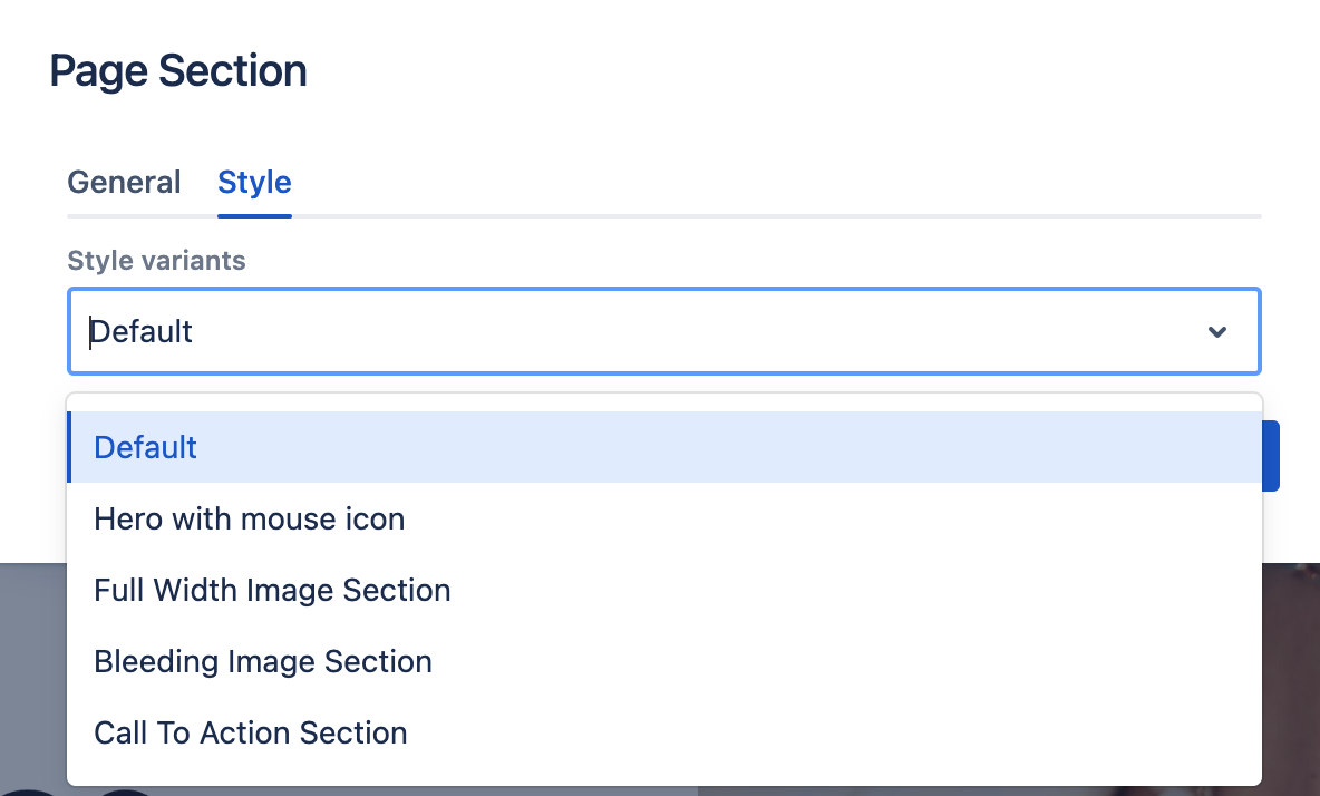
Page Section variants
Check the Style tab in the authoring dialog to see the available style variants for the Page Section component.
Here is an example of a "Hero with mouse icon" page section (with some content inside):
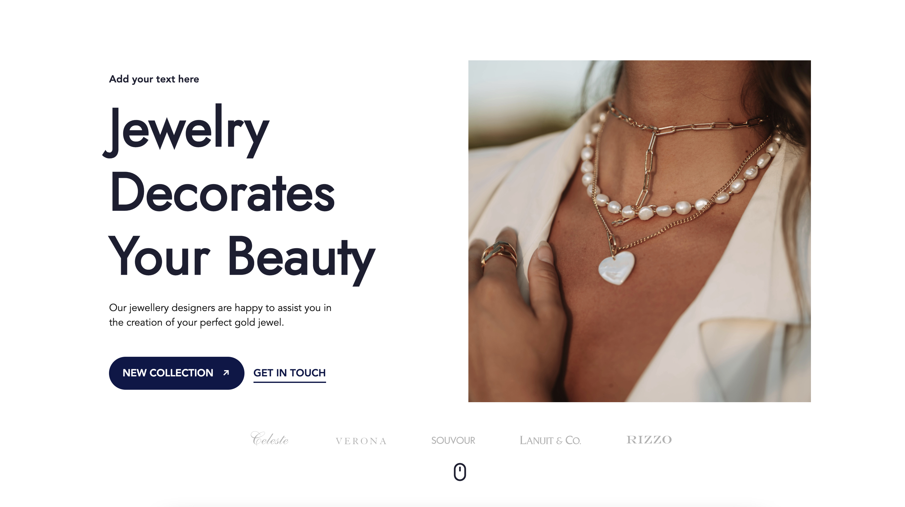
Please note that Page Section's variants work only with properly structured content inside.
In order to speed up the page assembly, Howlite project provides predefined page sections in the layouts left side panel. You can preview different types of Page Section variants with properly structured content, by drag & dropping one of the predefined layouts below to a page. See the layouts page for details.