Title component
Title component can be used to add a page or section title.
Usage
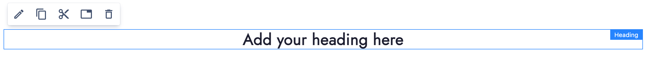
Drag & drop title component to a Page section. By default, a placeholder with "Add your title here" text is visible:
Authorable properties
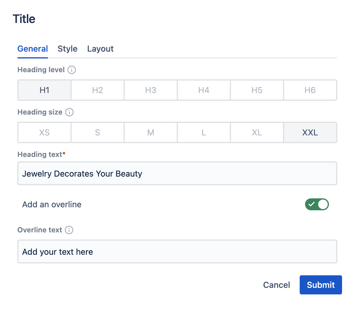
Click  ("Edit" icon) to see all title component's properties:
- You can select Title level that is most appropriate from SEO and accessibility perspective (options H1 - H6).
- You can select Title size to increase or decrease font-size
- Insert Title text
- Optionally, you can add an Overline (kicker) above the main title
- You can resize the title as any other component using the Layout tab. (See grid description for details.)
Rendered component