Container component
Container component is used to group content together (inside a Page Section component). Container renders a simple div html tag without extra styling.
Usage
If you drag-and-drop a single Container component to the page, you will see a default placeholder.

Multiple columns layouts
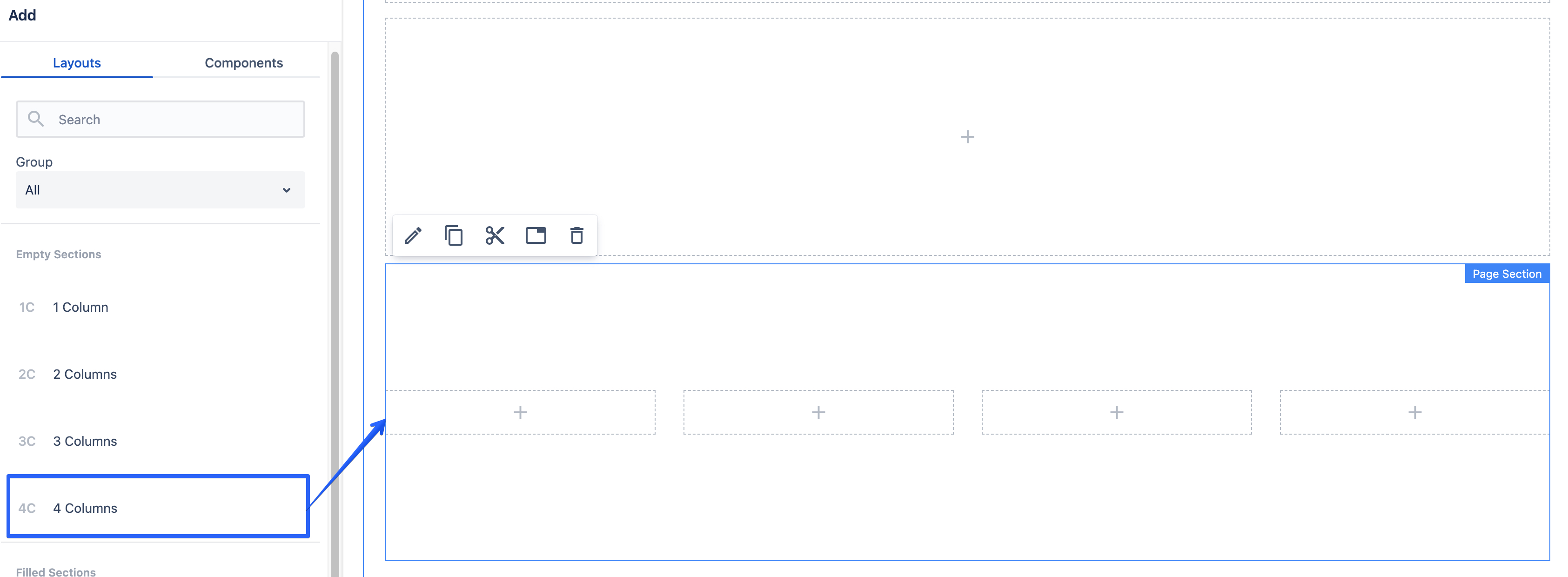
By using containers inside a page section, you can achieve multiple columns layouts. To see this in action, you can drag-and-drop the 4 Columns predefined layout from the Empty Sections group. See the layouts page for details regarding predefined sections.
This layout consists of a Page Section component with 4 container components inside. Each container is resized to use 3 out of 12 columns. For resize options description please see the grid page.
Authorable properties
Click  ("Edit" icon) on the Container component to see its all editable properties.
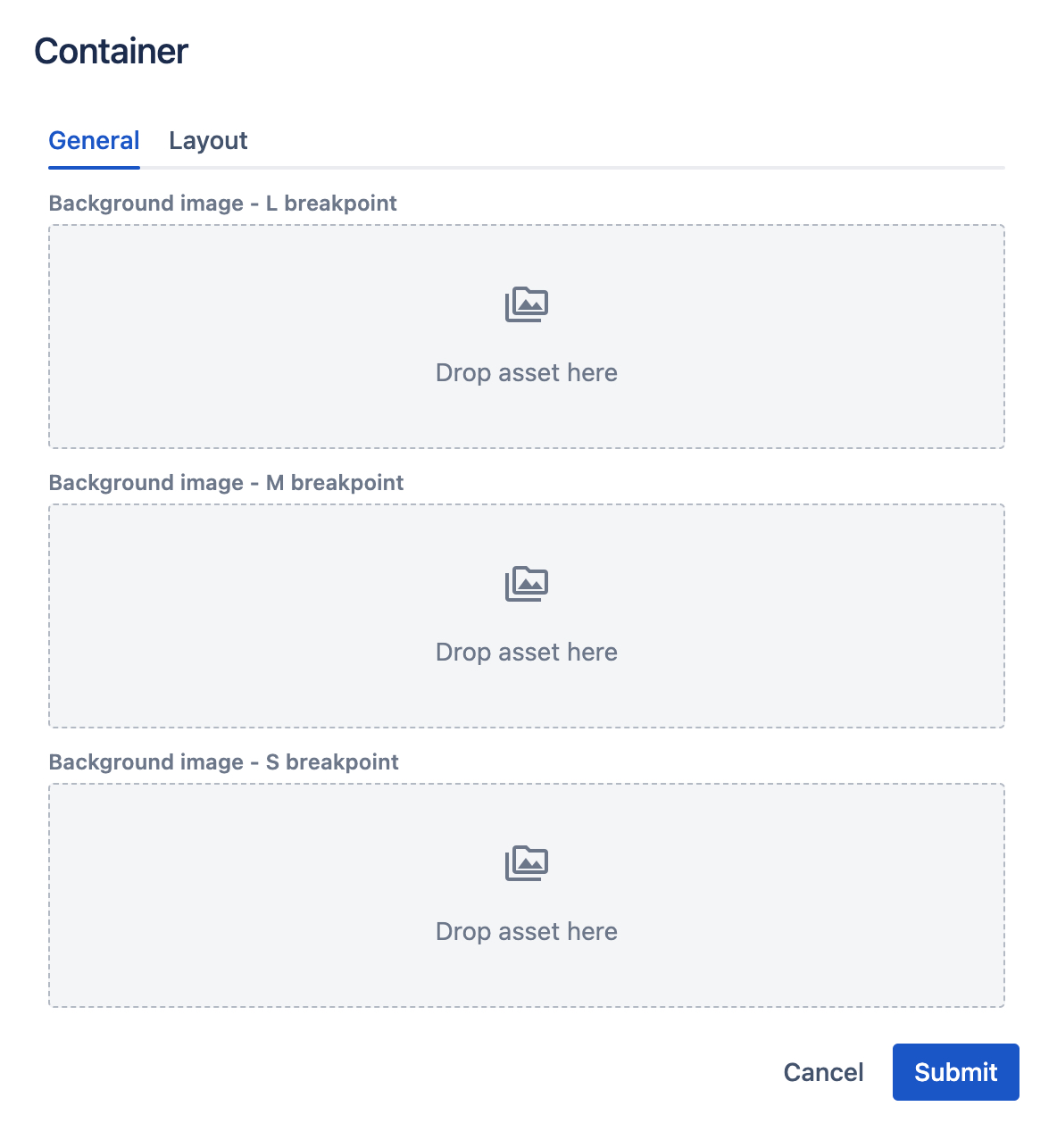
- General tab
- you can drag-and-drop an image from the left assets panel, to add a background image (for each breakpoint separately).
- each breakpoint's asset will be rendered on this breakpoint only. For example, if you leave M breakpoint image blank, nothing will be rendered on tablet resolutions.
- Layout tab and its properties are described here.